Entry 003: The Cavalry of Gaia the Fierce Knight
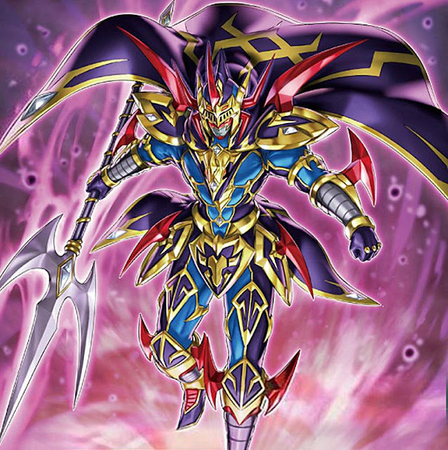
Under normal circumstances, I probably would've skipped Gaia here, unfortunately, but he is another of the more iconic monsters in the game's history as a signature card of Yugi. So it'd feel wrong to skip him. That said, yeah, as you can tell, his design doesn't impress me a ton. His armor is fairly non-descript and only really sticking out in the sense that it literally has a lot of bits that stick out. And his helmet just visually looks like a mess, looking more like something a teenage kid would wear at a skatepark thinking he looks way past cool in it more than anything practical a knight would wear. I know we've established with Dark Magician yesterday that subtly in design isn't exactly a priority for Yu-Gi-Oh monsters, but eh.
Oh, and his horse is purple I guess.
Personal Score: 4/10
And... eugh. Dude has a good amount of retrains that I'm equally ambivalent toward, and a lot of my criticisms of Gaia apply here as well. So I don't really feel the need to comment on them other than just bringing up the fact that they exist.
There's obviously Gaia the Dragon Champion, but I'll save that for the review of his other component, since this one'll be going on long enough. Instead we have "Lord" Gaia, riding a far less cooler dragon than his Dragon Champion version... but I guess at least his armor doesn't look like as much of a mess now?
Personal Score: 5/10
Again, I'll concede that subtly isn't in the Yu-Gi-Oh brand very much, so on the standard of other monsters, this is nicer armor design at least. I still think it's on the cluttered side, and the miscellaneous spikey bits are a bit much, but at least his helmet is a little better looking?
Personal Score: 6/10
Unfortunately... it kinda just dives right back into nonsense. This odd robot version of Gaia looks a little cooler on first brush, I especially like how it looks like he's just merged into the back of his horse. But... I just can't. That armor design again just looks far too garish to sell him for me, not when they're trying to make him look badass. Especially with the way the whole thing comes together to make his design look more like an action figure. Between the bright colors, visible joints, and comically proportioned spears, I don't hear "Force of the Earth," I hear "Batteries not included."
Personal Score: 3/10
This upgraded fusion is notably better than "Force of Earth". Suprisingly enough though, once you fix his toy-like appearance problem, him being a robot actually works a lot better with his weird choice in armor design, cause at least then it's easier to buy. Like I said before, I like how he looks fused to his horse's back, as well as turning the horse into a mecha-pegasus to "up the ante" so to speak. It's also cool to see a color scheme usually associated with holy knights or white paladins or what-not so violently juxtaposed with all the red spikes to give it just a bit of edge. So hey, it all worked out!


Comments
Post a Comment