 208: Steelix
In the second generation, they handed ol' Onix a new evolution, but it mostly seems to exist to be a mascot for that newfangled Steel type, what with the series' first Steel Gym Leader having it as their signature Pokemon and it being the first non-Magnemite Steel type in the 'Dex. As such, it's lightly awkward to see this thing just be Onix but more. We THINK the idea is that it's Onix but covered in a new coat of metal, some kind of Metal Coat if you will, but it still has to look more evolved so they add bits and bobs to it that make it feel just that little bit more awkward.
Like, we're not sure what those spikes along its body is supposed to even do. They spin around, so we GUESS they're meant to be some kind of digging apparatus, but more than anything they look like they'd make digging more difficult to do but just being blunt, abrasive spikes jutting out your side.
Steelix's face has a bit more going on, with its new Steel type giving it a BIT more of a boxy shape language, with a more symmetrical head and more blunt jaw. The only obvious downfall its face has is being a tad more generic. Onix had the energy of a wearing, old stone monster, but this face feels a bit more of a par-for-the-course anime monster face.
Personal Score: 6.5/10
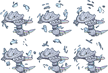
Mega Steelix, however, feels like the Pokemon that makes the worst of the Mega's aesthetic problems the most blatant. It's like they had a few cool ideas but rather than focus on one and enhance its look (or, god forbid a Pokemon that isn't Mewtwo or Charizard get two Megas) they decided to cram everything into one and it just looks messy.
Its head becoming more shovel-shaped is cool, and that combined with the excavator teeth on its chin could've been something neat. As are the metal shards orbiting around its head, apparently the idea being that a magnet in its brain has gone into overdrive. But then everything else is just. Why. What's up with the segments with blue rings on them? And the crystal effect is neat but, again, feels like it should've been on a "Mega Steelix Y" instead.
I think the the easiest way to clean this design up would be to simply make the rest of its body looks a bit more like how its head changed; a little more smoothed out, like "refined" metal that's actually been shaped into a tool of some sort, rather than going extra hard on the clutter.


Comments
Post a Comment