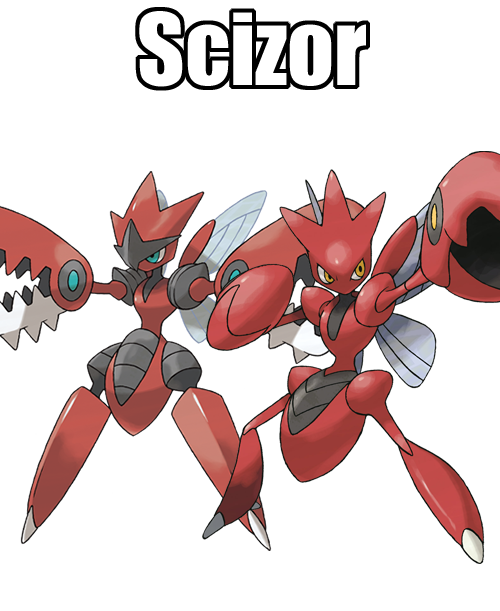
 212: Scizor
Yet another Metal Coat evolution is one for Scyther, which on the surface feels like it barely changed. Mainly in having its rough edges smoothed out to appeal to the sleek, metallic look a little more. It also has pincher claws in place of scythes for arms, which amusingly makes this thing look more lobster than mantis, especially with the red coloration. A large part of the color change does just seem to stem from the fact that it's already still so similar to Scyther, so may as well invent a bit of a alternate-colored rival.
Especially since this evolution doesn't give a flat-out better stat distribution, rather it rearranges the stats but has the same base stat total. Kinda wished that happened more often with evolutions, to allow Scyther a higher speed stat while Scizor sacrifices speed to gain more attack and defense. We can't help but wonder if that newfangled Kleavor is gonna follow suit, or if it's going to elect to have a BST higher than its linemates.
Its design itself is alright. Its appearance is a bit too much like a plastic action figure for our liking, but I guess that's just a consequence of an insectoid creature having such a smooth exterior in a cartoony style like this, you end up with a design that's segmented and smooth and it just comes off that weird. Though we're mostly bothered by how it looks even less like a mantis now. We're all for inventing a creature, obviously, but that somewhat backfires when a mantis has so many cool aspects to it that this line just weirdly refuses to represent.
Personal Score: 6/10
Scizor's also one of the lucky Pokemon to get a Mega, and it does not really use this chance well. The plastic figure complaint gets magnified here with gribbly, meaningless details, and especially a head crest that gets haphazardly plastered on with little rhyme or reason to it. The guy getting Final Wars Gigan-ified with huge, toothed hands is fun at least, almost feels like they're doubling down on how the eye spots on its pincers before kind of made them look like extra heads. That in and of itself is neat, but then we keep moving south and WHAT have you done to the poor guy's legs. Those are barely even legs! Those are just big, immovable slabs masquerading as legs! It's just sad to say this design isn't helping this trend of rather mediocre Gen 2 Megas.


Comments
Post a Comment